Wednesday, June 30, 2010

Groovy Ride, Man!

My DH thinks I'm addicted to this PTI Enjoy the Ride car.  Ok, well, maybe I am, but with good reason--it's just so gosh darn cute!  This is the fourth card for this month's Viva La Verve challenge, so only one more to go for me.  The second bedroom was full of bright flowers, which led me to this October Afternoon Detours paper (the stripe paper is also from the same collection).  I first planned to have a Scarlet Jewel car, but then got to thinking how groovy a flower-child car would be and stamped it out of the patterned paper.  The headlights and bumper I stamped, colored (silver prismacolor pencil, yellow copic, frosted lace stickles) and cut out from some white paper, and then I found two blue blank spots on the patterned paper for the window & license plate.


I stamped the sentiment using Memento Rhubarb Stalk onto Gina K cream paper, and cut it using the L5 oval nestie, with a Kiwi Kiss scallop.  The orange paper is the new SU Peach Parfait in-color (my super nice demo sent me samples of all the in-colors and new core colors).  I embossed it with a Sizzix texturz plate.  Added the red brads and foam-mounted the panels.  I'm going to use my best Austin Powers voice for this next line:
Groovalicious, baby!

I got my new SU catalog the other day and have made a big wishlist.  Only a couple new stamp sets really won me over, but I'm going to pick up some dies and some new colors. I like most of the new colors, but it seems like there is a lot of overlap--there's three light pinks, two light greens, and two rusty reds.  Plus I don't understand Early Espresso at all--would have much rather them kept Going Gray instead.  The ribbon selection was just sad and made me appreciate PTI's ribbon selection and price.  Are you an SU fan?  What do you love/hate about the new catty?

Monday, June 28, 2010

Take Me Out to the Ballgame!


This card is for my nephew's birthday.  He loves everything baseball, and was even chosen for his hometown's all-star team!  It's a 5 1/2 by 5 1/2 card, and the squares are 1 11/16.  The papers are (clockwise starting from top left): Cosmo Cricket Core-dinations, SU, October Afternoon, SU, Cosmo Cricket Core-dinations, SU, Jenni Bowlin, and SU. The middle square is Jenni Bowlin.  The baseball is a L5 nestability circle cut from PTI Rustic White and sponged with Colorbox Creamy Brown. I then used the die to draw the curved seams, tracing inside & outside the die.  I then lined up the SU paper piercing template and pierced a dot on the inside line, outside line, and in the middle, rotating the template around each time.  I then sewed from the outside/inside to the middle dot in the row above.

For the flag, I cut out the wavy triangle from SU Night of Navy, and stamped and embossed "Will" using The Cat's Pajamas Coolvetica alphabet.  I punched two holes and threaded a toothpick through (I sanded down the pointy end a bit).  I hope Will thinks it's a home run card!

Do you like to read?  Do you, or someone you know, have a Grandma?  Do you like the South?  Then, honey, you need to get yourself The Sweet By and By right now, which (mostly) takes place in a nursing home.  It's one of those books I want to give everyone I know!  [Note: I say "give" because I picked up from somewhere that you should never loan a book, because that just puts pressure on the other person to read it, or they never give it back and then you're out a book, so you should either give your used book or keep your used book and buy a new one to give.*  Saves everyone awkwardness and/or heartbreak]
*I know I do run-on sentences quite often, but man, I would hate to have to diagram that puppy.

Although I wouldn't recommend these next two books for everyone, I found also found them page-turning-y and entertaining.  A Reliable Wife is a suspenseful, steamy novel set in 1907 Wisconsin.  Whether the goosebumps were from the description of the Wisconsin winter or the suspense, it certainly took my mind off the 95+ degree summer.  Life as We Knew It is a young adult novel, but don't let that deter you.  I would call it "The Road" for teens.  It's the first of a trilogy and I'll be picking up the next two soon.

What books have been home runs for you recently?  (Or strike outs, because it's good to know what's bad, too!)

Sunday, June 27, 2010

Two for the Price of One!

This week's Res-Q-Challenge was to use emboss resist. I was playing around with different ideas and ended up with two panels that I liked, so I went ahead and made two cards.

This first card is also for the Taylored Expression Sketch Challenge. (Hey, did you notice that badge over there --> on my sidebar? I was chosen as top crop for my Medallion Anniversary Card. Yippee!) I stamped the Wplus9 flowers with versamark onto SU Baja Breeze and clear embossed, then rubbed some PTI Fresh Snow ink around the flowers, then rubbed it off the embossed flowers. The tag is punched from PTI Melon Berry, stamped with PTI Mega Mixed Messages sentiment. The SU Baja Breeze button is tied onto some generic kraft-colored ribbon with some linen twine. I punched the PTI Kraft & SU Baja Breeze scalloped strips using Fiskar's Threading Water punch, then placed some self-adhesive Hobby Lobby pearls on the punched holes. The background layer is Cosmo Cricket Core'dinations paper, sanded.

I went with a cleaner-and-simpler layout for my second card, using the CAS25 sketch from last summer that I think is my favorite sketch of all time. After clear embossing the flowers on Baja Breeze again, I brayered Not Quite Navy over it. Since I liked the look of the white halo in the first card so much, I added it to this card too. The sentiment is from Verve Forever in Our Hearts, stamped on SU Baja Breeze. The ribbon is the reverse of some American Craft polka dot ribbon--I love the softness of the dark grey instead of black. The image is matted with PTI Smokey Shadow. The dp is Stampin' Up from last year.

Here's my odd encounter of the day: DH and I were outside trimming hedges and suffering heat stroke, when DH says, "there's something you don't see every day" and I come around from behind the hedges to see two horses walking down the sidewalk (they were being ridden, I mean, this is a nice neighborhood, we don't let wild horses just roam here. ;) ). They were visiting the people next door. So, uh, that was weird.

Friday, June 25, 2010

Dear Don Draper

I'm sorry I said I wasn't thrilled with the beginning of Season Three of Mad Men and that it seemed to be moving a bit slow.  Ever since "Guy Walks Into An Advertising Agency*," this season has been awesome!  I don't think we'll be able to wait until the DVDs for Season Four; I'll plan on seeing you July 25th!
Yours fondly,
Corgi Creations
*best episode title ever

Is anyone else a Mad Men fan?  If so, have you seen this Don Draper's Guide to Picking up Women from when Jon Hamm hosted SNL the first time?  "I saw him dancing...until the accident" makes me pee my pants every time.

Anyway, onto the card!  I finished the last two cards for the Verve Challenges, but the last one is just too meh to post.  But I did like this one:

The paper (including the die cut) is still October Afternoon Daydream collection.  I stamped "i miss you" from Wplus9 Funky Foliage using PTI Ripe Avocado ink, then masked it and stamped PTI Background Basics: Hearts in Versamagic Aegean Blue chalk ink.  Sponged the whole thing with Colorbox Creamy Brown chalk ink, then rounded the corners and mounted on PTI Ripe Avocado.

Whew, I think I am all creatived-out for today; I guess it's time to go visit some blogs & the SCS gallery for inspiration!

Thursday, June 24, 2010

It's like Isner v. Mahut, but with cards!

Did anyone else watch/read/listen Wimbledon's longest match?  The guys played for over 11 hours (I watched the last twenty minutes)!  So that got me in the mood for some marathon card makin' for the Verve Release Challenges.  I can spend forever planning what stamps and paper to use for a card, so I limited myself to using (mostly) Verve stamps and to using papers from October Afternoon Daydream collection.

Game
I am in love with this paper! Even awesomer, the paper pack had some diecuts and one of them was a smaller version of the print, which I used for the balloon from Verve's Up Up & Away.  I inked the edges with a little Colorbox Creamy Brown Chalk Ink.  I used my almost-last-scrap of PTI Aqua Mist and embossed the clouds from the same Verve set with white embossing powder.  The sentiment is from PTI, and yes, I did plan it so the love was in the cloud.
The buttons are from my button stash, I think the brown one may be SU and the blue ones are from PTI Ocean Tides. I cut little strips of paper to "thread" the buttons.  The brads are Hobby Lobby and the ribbon is PTI Dark Chocolate Twill.

Set

I know, I know, normally I don't equate frogs with "happiness" of any sort, but this Cat's Pajamas Prince Charming is just too, well, "charming." I colored him with SU Old Olive marker and Prang Metallic Gold Marker.

The sentiment is from Verve's Kindred Spirits, the patterned paper is still October Afternoon Daydream, the card stock is SU Dusty Durango and Old Olive.

Match
This card came together way too easily!  I don't know why I've never used these journaling tags before; they are so much fun to frame an image with.  The polka dot, flower paper, and tag is still from October Afternoon; the text paper is PTI Sweet Blush stamped with PTI Text Styles.  I sewed around each panel, then used my fingernail to distress the edges a bit.  The butterflies and sentiment are from Verve's Petals & Stems and Fluttering By.

I stamped the butterflies onto PTI Sweet Blush, put some clear packing tape on the back (one of the best tips ever--it really adds stability to those little pieces like the antennae), cut out, and adhered with glue dots. 

Fun Isner v. Mahut Facts: They played 980 points with 2198 strokes. Isner had 112 aces and Mahut had 103; the previous record was 78.

Fun Meg Tennis Fact: My DH and I are at the pro level at doubles tennis in Wii Sports.

Wednesday, June 23, 2010

You Can Do It!

I made this card for my sister-in-law, who is running/biking/swimming the Ironwoman Triathlon next week.  Ok, well, to be truthful, I made this card for the Viva La Verve challenge but it just so happened I liked the retro bike image (and the Moxie Fab Bicycle challenge)so that's how it ended up being for my SIL.  I was inspired by the patchwork quilt in the third bedroom.  I punched one inch squares from all sorts of scraps--October Afternoon, SU, Jenni Bowlin.  Some of them I even punched from the small pictures that they put on the front of paper packs.  I didn't plan ahead too well so two of the cuter squares are covered by the image, while you end up seeing that not-my-favorite bird paper. Oh well, that's the joy of quilting, right?  It's a 4x5 grid, so that means 20 squares and I inked the edges of each square which means...80 edges to ink. My chalk ink pad is in rough shape right now!  After adhering all of them to a 4x5 base, I sewed all the seams on my Sew Mini. 

The image is from Unity's August '09 Kit of the Month, stamped with Memento Rhubarb ink.  I love this color, it's a nice red without being too loud.  The sentiment is computer-generated using Rockwell font. The ribbon is SU Kiwi Kiss.  The "quilt" is foam mounted and the image panel is double foam mounted.

So I "splurged" and picked up the Fiskars cutter I mentioned yesterday. I say "splurged" because check out the deal I got: all Fiskar tools were 60% off at JoAnn's, then I get an additional 15% off with my teacher discount card.  So I picked up the $30 trimmer, $6 refill, $10 star punch and another $16 dollar star punch for...wait for it....wait for it....$23!!  And then we saved $25 at the grocery store, so it's really like it was free, right?

Speaking of "free," I have to work locker sign-up at my school today, which is 10,000 times better than working registration, which is when we collect fees.  Note to parents: "I thought this was a free education!" was funny the first 318 times we heard it never.

What annoying "joke" could you live without hearing ever again?

Tuesday, June 22, 2010

Three Things I Wish Someone Would Have Told Me

I'm going to make you wait until the end to read about the three things, since they are not stamping related (and because I'm a blog tease).  First the card for today:
I set a goal to try and finish all 5 Viva La Verve challenges for this month.  I love sketch challenges and I'm starting to really get into inspiration and color challenges, and the VLV challenges are a great combination.  This is for the 3rd week.  I was inspired by the second bedroom; I think I would have keeled over if I had this fabulous room as a kid (or as an adult).  I used the color combination, of course, as well as trying to keep the whole card feeling as glamorous as the room.

I saw Becky's flower today and thought that it was maybe a distressed flower I could handle.  I have not had much luck in making my own look as wonderful as all the million tutorials.  Like Becky, I cut out my blossoms using Nestabilities, then stamped PTI Polka Dot Basics II and PTI Text Styles in Hibiscus ink, crumpled, and cut the petals of the two middle layers.  The green layer is 3 blossoms the same size as the largest pink, then I cut them in half and overlapped them in order to get the green layer just slightly larger than the flower.  I cut the ends of the rhinestone brad off and glue dotted it to a black button.  The tag is stamped with PTI Mixed Messages.

The pink layer is embossed with a Cuttlebug embossing folder, the ribbon is from PTI and the brads are from Hobby Lobby.  I stamped the spring moss layer with leaves from an old SU set using Versamark.  Now I just need to figure out which one of my friends is glamorous enough to full appreciate this card! 

Ok, now the moment you've all been waiting for.

Three Things I Wish Someone Would Have Told Me

1) The Curly Girl Method/Hair Plopping I stumbled upon this when looking for a new flat iron. I actually use a low-sulfate shampoo instead of no-sulfate (Tresemme which was on sale at Target for $3.99 for a huge bottle), but my favorite part is the hair plopping.  My hair, which is usually bleh and wavy and frizzy and meh, ends up with fabulous curls with little-to-no effort except waiting for it to dry.  I can't believe I've been going to hairdressers for 30+ years and not one has told me about this.

2) Next-day Bread Bags.  We eat sandwiches for lunch quite often and love fresh bread from the grocery, but hate how we end up throwing away half the loaf the next day because you could use it to drive nails into steel.  A few weeks back we were at Publix looking for bread and the baker asked if we were eating it today or tomorrow.  We answered "tomorrow" and she handed us a bag from a pile near the bread. --it's a "tomorrow" bag instead of the "crispy" bag they normally use.  The bread is fresh and soft.  I mean, there are no signs around saying "Hey, if you're going to eat this tomorrow, put it in one of these bags!" and when I told my friends, they had no idea about it, either.  Maybe it's just a Publix thing?

3) Eye-fi is awesome. This was my anniversary gift.  It's an SD card that uses your wireless network to upload the photos automatically to your computer.  So by the time I'm done taking my 10 card photos, they are already in Picasa, ready for me to edit!  No hooking up the camera, no taking the SD card out to put in a reader.  I've been using it for the past few days and love it.

What are some things you wish someone would have told you about earlier?

Monday, June 21, 2010

CAS72 Craziness

Today's SCS CAS Challenge was a sketch challenge and I went a little crazy with it.  (Did you see Guest Designer (and fellow Alabamian) Melina's shabby chic card? Fabulous!)  This is the first card I made, which turned out not very CAS-y.  I also used the colors for Wplus9 Color Challenge (aqua, brown, green, orange) again.

I stamped PTI Dark Chocolate with Wplus9 woodgrain using Memento Rich Cocoa, then freehanded the tree and branches and cut out.  The bird is from the Wplus9 Woodgrain Additions set, stamped using Memento Cantaloupe onto PTI bitty dot paper in Summer Sunrise.  The sentiment is from Verve, with a PTI Vintage Labels border.  I die cut the orange using Nesties Label One, then traced around the outside of the die cut for the Kiwi Kiss border. The floral paper is PTI Green Tea Leaves.

I thought I should probably do a cleaner-and-simpler card and found these great Jenni Bowlin mini papers buried in my patterned paper drawer, which then led to two more cards!
Aw, look at the cute lil' puppy!!  I just picked up this stamp 40% off at Joann's and this puppy has been sitting on my desk pleading me to use it since then.  I stamped it using Memento Rich Cocoa, then used an aqua brush and a brown watercolor crayon to color it.  Some inking on the edges and called it done.

Finally, this was actually the stamp that started my whole card-making plans today!  It is the first time I've inked up the Wplus9 Funky Foliage.   The sentiment is from PTI Mega Mixed Messages and the papers are more Jenni Bowlin.

JoAnn alert: I saw in the paper yesterday that all Fiskars is 60% off.  I think I may have to break down and buy that new fancy paper cutter with the wire guide.  I have a tonic but I can't stand trying to read the measurements and I do love my old school Fiskars when I break it out.

Hope everyone is having a great Monday!

Sunday, June 20, 2010

Got Corgi?

Hello to all my loyal fans!  Sorry I've been neglecting my poor blog in its infancy, but my mom came to visit last weekend (superfun!) and then my DH and I were in Washington DC visiting his mom Tuesday through Saturday (also superfun!).  We got back home around midnight last night, and then today it took me way too long to make this card today (but I had fun, and isn't that what's important?)

I couldn't believe it when I read the SCS Free-For-All challenge from Friday: a card honoring man's best friend!  HELLO!  Perfect challenge for me! And, yes, I even got the bonus points since it is a Father's Day card for my DH from Addison. Plus I used Wplus9's color cue challenge of brown, aqua, orange, and green (way out of my comfort zone--I mean, orange?!?) and Karen's Sweet Sunday Sketch Challenge 74

I started stamping the Eat Cake Graphics dog onto Gina K Cream paper.  If you look at the ears, this dog is obviously a corgi, yet for some reason the stamp has a tail on it (or maybe it's a cardigan?) (or maybe I see a corgi in every dog stamp with big ears ;) ).  Addie's fur is so hard to color match.  I used Burnt Ochre Prismacolor pencil to lightly draw some fur (I used sepia for the ears), then colored over it with a Y21 copic (and YR00 for the ears). It's an easy way to get a furry effect.

I used L4 and S5 square nesties to cut out the cream and the SU Baja Breeze, then used my new early birthday gift of Big Scallop Squares nesties to cut out the SU Dusty Durango.  The green dp is from an old SU pack and I stamped it using a Studio G alphabet with Memento Rich Cocoa ink.  The big We R Memory Keepers eyelet I picked up at TJ Maxx-they had a fairly large selection of eyelets, jumbo eyelets, and snaps for $2/package (they had some near the stationary section and then an even larger supply at the checkout lane if you want to try to score some).  And as you can see, I went a little crazy on the distressing to make it all "manly" and such. 

I still have posts from last week to read in my google reader--so many pretty cards to look at.  Also, remember that today (Sunday) is the last day for the 10% off sale at Verve, The Cat's Pajamas, and My Favorite Things (code for MFT: SUSIEQ) with a portion of the proceeds benefiting Susiestampalot as her husband undergoes cancer treatments.  I heard that if you are buying stamps for a good cause (especially if you are helping someone fight stupid #$@%* cancer), the money doesn't have to come out of your stamping budget, it can come out of the "help your fellow man" budget, so buy up some stamps, peeps!  If you're reading this Monday, you can donate directly using paypal on Susan's blog. 

Friday, June 11, 2010

Doggies and a Bug


Ok, how cute are these pups in the VW? This card is for my dad for Father's Day. I had a fire-engine red 1972 Beetle when I was in high school and always drove around with my two goldens in the back, so I know my dad is going to love this card! This is also for a Viva La Verve challenge. I hope to finish all five VLV challenges this month.

I stamped the VW from PTI's Enjoy the Ride, then used a post it note to mask while I stamped the dogs from PTI's Tiny Treats: Valentines. I colored the VW with copics (adding a little frosted lace stickles to the headlights) and coated with glossy accents (I really should buy stock in glossy accents with the amount I'm using it). I cut it out and layered it onto a cream circle (small nestie circle #5), then cut out a square (small nestie square #6) from my "practice sheet" of clear embossed wood grain (from Wplus9).

The stars dp is from October Afternoon and the red strip was versamarked and clear embossed with PTI Polka Dot Basics II. The sentiment from Enjoy the Ride was stamped and embossed with black embossing powder (also proving my theory that black embossing is much easier to do on smooth patterned paper rather than card stock..almost no strays here). The whole shebang is mounted on PTI Dark Chocolate.

I get an unexpected treat this week! My mom found a last-minute deal on a flight so she is coming to hang out for a few days. Looking forward to lots o' shopping and food and girl talk, so my blog may be quiet for a wee bit. Enjoy the weekend, everyone!

Thursday, June 10, 2010

Father's Day Card


Another Snoopy card for my DH's father, this one for Father's Day. Maybe this one will actually be given instead of staying on his desk. I used this week's Mojo Monday sketch--this week it's a prize week! I also submit this as exhibit 14a as proof that you cannot make a bad card with this paper from SU's Washington Apple pack. For some reason, I thought paper piecing this stamp would be easier than trying to match the colors in the dp. I started with stamping onto PTI Spring Rain and then stamped, cut out, and adhered using my xyron (in order from bottom layer):
Sand from PTI Kraft
Ocean from PTI (aptly named) Ocean Tides
Sun from SU So Saffron
Beach chair & umbrella from SU Chocolate Chip
Beach umbrella from PTI Bitty Star Paper
Beach chair from SU Washington Apple pack
Snoopy from PTI White
Beach chair rails from SU Chocolate Chip

Extreme closeup:
I think it ended up being worth the effort to cut out. I printed the sentiment using Ablemarle font. The ribbon is a Hobby Lobby $.99 spool that matches pretty nicely. I cut the scallop edge using my corner rounder with the corner guard removed.

Have you finished your Father's Day card(s) yet?

(another question--are the photo showing up ok for you? I'm struggling between making them big enough to see the card nicely versus running over the right sidebar. Fellow bloggers...what size do you normally size your photos to?)

Wednesday, June 9, 2010

"Blog Candy" Winner

I cannot believe that not only do I have a blog, but I am now writing a post involving a blog candy winner.  Who am I and what have you done with the real Meg?

And the winner is...

Here are your random numbers:
3 
Timestamp: 2010-06-10 03:27:29 UTC
Hooray for Karen! 

I don't know, should I give Pride and Prejudice and Zombies another go?  I finished Mennonite in a Little Black Dress which was....well, it started off funny and then got a bit too serious and navel-gazey.  I also finished off Sharp Teeth, a book written in blank verse about werewolves in LA, that I picked up due to Nick Hornby's recommendation.  And I must say I've never read anything like it and it was a page turner to see if he was going to make all the puzzle pieces fit.  Anyone have an good recommendations?   Maybe when I hit 500 I'll have a massive book giveaway.  :)

(as a side note, thank you everyone for the anniversary wishes!)

Love is in the Air


...because it's our 3rd anniversary today!  I cased this card from Vanessa Menhorn because it's so adorable and I knew my DH would LOVE it (he's a big fan of planes.  BIG fan).  I stamped the PTI Tiny Treats: Valentines plane onto PTI Ocean Tides cardstock, colored in the propeller & heart with prismacolor pencils, cut out, and glossy accented.  The hearts are from the Fancy Pants Little Star set (which, even though it is a "baby" set, is actually a useful all-around set with hearts and stars and leaves and birds and swirls).  I stamped them onto PTI Berry Sorbet with versamark and clear embossed.  I used embroidery thread to tie around the hearts and adhered the thread to the back of the plane.  Then the plane and hearts were all popdotted.

For the clouds, using a stencil cut with a scallop circle nestie, I sponged PTI Fresh Snow onto PTI Sweet Blush and heat embossed with white embossing powder.  Matted with Berry Sorbet and mounted with foam tape.  For as clean as my black embossing was on my medallion card, after a few attempts embossing the sentiment, this was as good as it got.  Maybe it doesn't like the cardstock and prefers the smoother dp?  Hmm...

Inside I put five coupons for free hugs.  See why here: Modern Family

So for our third anniversary, I hope you indulge me in a little top three list of why my DH is the bestest.
 He can finish the line to the song I'm singing from Dr Horrible.

 He makes me feel like somebody loved.

He is my shelter in the storm.

Tuesday, June 8, 2010

Another Anniversary Card

First of all, the mystery has been solved: Dawn of Wplus9 was sweet enough to leave a comment and explain what Wplus9 stood for: 
Wplus9 is short for my last name "Woleslagle". W plus 9 letters. No one can ever spell it or pronounce it, so Wplus9 sort of became a nickname. (thank goodness it's not the Kate +8!)
 Although that does bring up a whole new mystery, how do you pronounce "Woleslagle?"*  In honor of the solved mystery, I made another card with the Wplus9 Woodgrain sets:

Edit: I got an accidental sneak peek of the Res-Q-Challenge for this week in my google reader.  Then I made the card and went to link to the post only to figure out the new challenges are posted on Fridays.  Doh!  I tied the twine around three times. 

Yes, this is another anniversary card, but no it's not for my hubby.  It's for my parentals--43 years next week!

This paper was the back of the October Afternoon Daydream ledger paper I used for my card yesterday, and I was just in love with it.  Not only that, but it's a perfect match for PTI's Aqua Mist.  I stamped the flowers with Versamark and clear embossed.  And then--then!!--I stamped the woodgrain onto Dark Chocolate with Versamark and clear embossed.  The result was heavenly; I almost hated to cover it with the image panel!  Extreme closeup:


Although I think my clear embossing powder has been tainted with some white, unless there's another explanation for the white specks that I'm unaware of.  

And did you check out that fabulous burlap twine?  Emily (aka Stampingout) was sweet enough to send me a bunch of it in different colors after I left a comment saying that I need to get some after seeing her wonderful rainbow card.  Thanks again, Emily!  The button was from PTI Ocean Tides stash, with the shank dremmeled off by DH.  Punched the tag and stamped Happy Anniversary from PTI's Mixed Messages.  

Are you still reading?  Well, my friend, have I got some blog candy for you:  in recognition of having over 100 hits (watch out, Beate!) and because this was a good book that wasn't worth much to sell on Amazon (wow, are you feeling the love?), one lucky random commenter from this post will win a gently-read copy of Addition by Toni Jordan.  I really enjoyed it as a nice summer read.  You may also choose to substitute Pride and Prejudice and Zombies or Confessions of a Counterfeit Farm Girl, neither of which I read more than 100 pages and therefore would not recommend, but hey, maybe they're right up your alley.  If history is any indication, you could possibly have a one-in-four or up to a one-in-one chance of winning!  I'll do a random number generator tomorrow evening.  I'm reading quite a lot this summer, so there may be more chances in the future for you as well.

Monday, June 7, 2010

A CAS challenge made for me!

This week's CAS challenge is to use a quote, verse, or saying as the focal point of your card.  I love quotes of any size or shape. At school, I keep a collection and write one on the board every day.  I don't talk about it unless one of the kids asks about it, but I know for some kids it's the best part of their math class.  And the warm fuzzies I get when I see them copy one of them down, well, let's just say I like posting quotes more than I like posting the objectives of the day.

Enough jibberjabber, onto the cards!
Here's the first and my favorite one:
This quote is just perfect for today, when we have to go buy Addison a 20-lb bag of her special vet dog food ("But I'm worth it, Meg!" "You're right, Addie.")   I stamped the quote using Memento Rich Cocoa and Rhubarb Stalk.  I covered "dog" and "rich" with a post-it, then took the post-it off and very carefully used the tip of the dew drop ink pad to ink them.  And it just so happened the stamp fit perfectly in the this column from some October Afternoon paper.  The little doggy is from Eat Cake Graphics, I colored her with prismacolor pencils and baby oil, then cut her out.  And then lost her on my desk, which led to a joyful rendition of "Oh Where Has My Little Dog Gone?" which then led to my real dog leaving the room.

Anyway, the background paper is from a new pack of Cosmo Cricket Core-dination paper.  It's pre-embossed so all it needs is a little sanding.  Adhered to a Riding Hood Red cardbase, then popped the sentiment & dog up using mounting tape (my new love!).

Up next, a card for both the Technique Lover's challenge and CAS card:
sentiment: "you make my heart flutter"

A fun card to slip into DH's overnight bag.  My current favorite technique is heat embossing, so I stamped the butterfly trail in Ripe Avocado & Versamark, then clear embossed.  I colored the sentiment with markers, as well as the butterfly.  I added some polka dots to the butterfly, because really, if you have a chance to add polka dots and you don't, you're wasting your time here on earth (see, I told you I was full of quotes.  Except I'm pretty sure the original mentions something about "make the world better" rather than "add polka dots," but we stampers know those are one and the same.)

And the third and final card that I actually made for the CAS guest designer challenge yesterday, but fits in with the theme:
 sentiment: Life is not measured by the number of breaths we take, 
but by the moments that take our breath away.
It was for the "sparkly" challenge.  I stamped the leaves and sentiment using colorbox bronze & versamark brilliance sky blue inks, then clear embossed.  I stamped the butterfly using Versamark onto the dp, which has the live/love/sing/dance words in metallic.

Supplies:
Card One: Eat Cake Graphics Dog stamp, Cloud9 dog quote stamp, October Afternoon Daydream paper pack, Cosmo Cricket Core-dinations, SU Baja Breeze & Riding Hood Red, Prismacolor pencils, baby oil


Card Two: WPlus9 Bird & Bees, Unity August KOM sentiment, PTI bitty box paper and Spring Moss cardstock, versamark, markers, clear embossing powder


Card Three: WPlus9 Woodgrain Additions, PTI Out on a Limb sentiments, PTI kraft cardstock, Kaisercraft dp, Colorbox bronze ink, Versamagic Sky Blue Brilliance Ink, Versamark, clear embossing powder

Sunday, June 6, 2010

New Stamps! Woohoo!

Someone mentioned Wplus9 stamps on Splitcoast the other day and I bought a few sets as a consolation prize for myself for not making the CAS DT finals (but I did end up winning a guest designer spot! yippee!  and the three gals that won made some a-maz-ing cards!).  I ordered on Wednesday and got my stamps yesterday in the mail.  I must say I am impressed by the quality of them, and can't wait to ink more of 'em up.  Does anyone know what W plus 9 stands for?  I keep thinking of Kate Plus 8.


These wonderful flowers are from the Woodgrain sillouettes and Woodgrain sillouette additions sets. She's having a deal where you can get both sets for $33, which saves you $5.  Add another $19 set and you've got free shipping at $50!  And these are BIG sets, ones that would cost you $24 each at other clear stamp companies.

I was inspired yesterday by this crib bedding at the inspiration challenge site (Heck, I was inspired by the whole site.  Inspired to win the lottery!).   That nursery with the huge windows and glider almost makes me want to have a kid. Maybe I'll just take the windows and glider and trade out the crib for a dog bed.

I stamped these flowers with some Colorbox pigment ink and added clear embossing to make it a bright card for the Fireworks CAS challenge.  I matted with both Kiwi Kiss and black, then added some Kiwi Kiss striped grosgrain because it's so yummy!

BTW, here is my $1 foam-core board "light box"
I got it from somewhere on SCS. The nice thing about it is that you can fold it half to store it.  Yes, I'll probably upgrade some day, but for now it's working for me.

(to my blogger friends: have you tried using draft.blogger.com?  It has many nice feature upgrades!  Like being able to choose a picture right from your picasa albums instead of copying & pasting links and fun customizable layouts.)

Saturday, June 5, 2010

Medallion Anniversary Card


This is the first of two cards I'm making for my DH for our 3rd anniversary next Wednesday. I really wanted to use the medallion for Taylored Expressions Sketch #116.

I started by stamping the Stampin' Up Medallion in versamark onto new-to-me discontinued SU paper and embossing with black embossing powder.

Ok, to be honest, I didn't start that way. I first tried to stamp the middle with cream and the outside with black and do clear embossing, but my black pigment pad turned out to be useless. Then I tried stamping the middle & embossing with white, then stamping the outside and embossing with black. Since you don't see that on the card, I bet you can guess how that turned out.

Anyway, I then went to work on the side panel. I knew I wanted to use the cream buttons--they were extras from my wedding dress, here they are on the dress:


The buttons were kind of lonely by themselves, so I added some black grommets that I got on clearance at HL. Now, of course I didn't read the fine print about using them with the Crop-a-dile big bite, but I thought that it was more of a guideline than a rule anyway. Turns out: grommets are not fun to pry out of your crop-a-dile. I ended up setting them with a screwdriver, which actually wasn't too horrible and about $30 cheaper than a big bite.

I printed the sentiment using Bernhart font (if you ever see a computer generated sentiment you'd like to have, let me know and I can post or email the file). After cutting it out with a Spellbinders ribbon tag die, I sponged some Old Olive onto it. This yummy scrunched ribbon is from Hobby Lobby, it was a set of 5 different colors for less than $5. The final step was attaching the two panels using Scotch Mounting Tape, which I must say I could learn to like. I'm definitely going to take Angela's suggestion of scoping it out at my local home improvement center (note to self: also get magnetic radiator covers for nestie storage needs!).

And just because this photo was near the other one and it makes me happy, I'm going to end my post with it.

A perfect moment from a perfect day.

Friday, June 4, 2010

Picnik Awesomeness

I started using Picnik a couple month ago and I'm starting to really like it, especially now that I've started blogging. Here a step-by-step of what I do for a photo (my first tutorial! It's like I'm a real grown up blogger!) (Note: Sorry the pictures are a bit too wide. I didn't think of that when I was doing screen captures on my widescreen monitor.)

1. Take 5-8 (or 10 or 12) photos of my card, using my 99 cent foam-core board "light box" and a Panasonic Lumix DMC-FH20 point-and-shoot.

2. Import images into Google Picasa, crop a bit, and select the best one to upload. Upload to Picasa Web Album, choosing the "small" size from the drop down menu.

3. Go to picnik.com. I upgraded to the premium version, which costs $5/month or $25/year. Some features are only available to premium users, but even the free version is pretty packed.

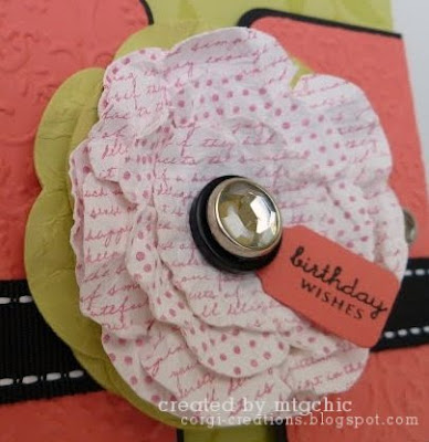
4. Go to library tab, select Picasa Web albums, then double click the photo you want to edit. This is the photo I started with.

5. Choose "Exposure" and "Auto-fix." This normally does a superb job.

6. Choose "Colors." The Auto-fix here always makes my photos too cool/blue, so I just use the neutral color picker. Click on it, then click on any white or black in your photo. Use the sliders to adjust if needed.

7. Straighten if needed. Click "rotate" then drag a line using your mouse along a side you want to be straight. Or use the slider.

8. Crop if needed. All these edits took maybe 2 minutes, tops, and look how improved the photo is:


9. Now it's time to create! Click the create tab. I like a soft glow around the photo, which you can find in effects. Choose "matte" then play with the size and strength.


9b. Or sometimes a matte doesn't look right and I want a frame. That's easy, too. Go to frames (duh!). Select "border." I like to make my corners curved. You can also change the color of the frame to match a color in your card. When you click on the color rectangle, just move your mouse over to your card to select a color.


10. Watermark! Option 1: Type it in. Choose "Text", type your text and choose a font, then click "add." You can then change the size, rotate, and move it. You can also fade, choose a different color, or choose an "advance blend."


Option 2: Add a watermark. I created a watermark in GIMP, then uploaded it to picnik. With the premium account, you can layer photos. To this, click at the bottom to bring up your photo basket, then drag and drop your watermark onto your picture. Then you can resize, change the color (if the font is in black), fade, etc. I made my watermark a creamy yellow to match the polka dots.
11. Click the "Save and Share" tag to upload your new version to Picasa Web Albums and/or save the new version to your computer. Here is the final before and after:


Let me know if this helped you out or if you have any questions!

Taylored Expressions(ish) Challenge 115

I made this card for last week's Taylored Expressions Challenge, but I ended up veering from the sketch a bit.

I had planned to make the butterfly the extra circle by the ribbon, but it just didn't look right. I also had planned to add some SU flower brads on the top and bottom, but they were too big for the space. I'm so mathy and rule-oriented that I always feel like I'm taking a walk on the wild side when I don't follow a sketch exactly (Yes, that's what passes for excitement in the corgi creations household).

The stamps are Verve Petals & Stems. I love this new-to-me old SU dp I found and wanted to use all the colors in it. So I stamped the flower using versamark onto Regal Rose and Pretty in Pink (I think--I'm never sure of the SU pink color names), embossed with clear embossing powder, and cut out. I did the same with the flower centers and butterfly with So Saffron paper. Then I used zots small glue dots to put it all together--I must say I like the thickness of these when I want just a little dimension.

I stamped the stems using Old Olive classic ink, which actually worked pretty well with the clear stamps. I can't pair the smaller stem in this set because it's too "wonky" when compared with the bigger one, (I'm not saying I don't have issues) so I just covered the bottom of the panel and stamped the bigger one again, making it shorter for the smaller flower. The sentiment from PTI Birthday Basics is stamped using Colorbox Rouge chalk ink. Can you believe how well that ribbon coordinates? It's some American Crafts that I've had for quite a while. After matting the image in old olive, I used foam tape to pop it up.

I think I've already mentioned all the supplies, but if you have any questions, let me know!

Thursday, June 3, 2010

ResQ Challenge Birthday Card

I must give a big shout out to all the semifinalists that were stalking the CAS DT thread with me Tuesday night (when Jen forgot what day it was and left us in suspense for 5 hours). I asked if I should start a blog and the overwhelming response was "YES!" Then a whole bunch of them were sweet enough to drop by and say hello after I announced that I had started this one.

So while we were waiting, we all spent some time visiting each other's blogs, and I made my first visit to the Res-Q-Challenge blog. The challenge that night was a red, white, and blue birthday card, which I ended up making yesterday (and therefore am a day late and a dollar short since there is a new challenge posted, complete with surgery scar pictures!)


For my money, you can't go wrong with Baja Breeze and Riding Hood Red. I stamped the flowers onto the white base as well as onto some Red Riding Hood. I colored the leaves with a prismacolor pencil and baby oil, cut out the red flowers and adhered. I stamped the PTI Vintage Picnic onto Baja Breeze, cut out, and adhered with new-to-me 3-D glue dots.

Which brings me to the question of the day: what's your favorite 3-D adhering thing? When I first started stamping about two years ago, I bought some foam dots at the dollar store that were awesome. Only now they are starting to use their adhesion (yes, I used the same pack for two years. And they were just thrown in a drawer, not in any plastic or anything. I'm amazed they lasted this long!) and I can't find them again. All the other foam dots seem too thick or too thin or too expensive. Let me know if you've found true love with a 3D adhesion item!

Back to the card, the rest is pretty simple--stamped the sentiment, cut out some nesties and accented with a white gel pen, and swiss dotted the bottom layer.

Thanks for ResQing me!

Supplies:
Stamps:
PTI Vintage Picnic
Paper: SU Baja Breeze and Riding Hood Red cardstock, sweet slumber dp, Gina K Pure Luxory White
Ink: Memento black, Colorbox Red Lipstick
Other: Prismacolor Pencil #911, baby oil, Zots 3-D pop dots, white gel pen, nesties